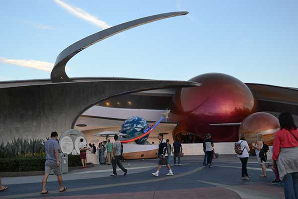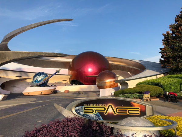
When Mission: Space opened in 2003, it signaled a different approach to Future World. Along with the nearby Test Track, this ride emphasized thrills to draw more guests to the park. The big-budget simulator arrived at EPCOT with sky-high expectations. Despite the lukewarm reception from some, the idea of space travel is exciting. Here is the current description from Disney’s website:
“Blast off on a thrilling simulated NASA-style mission to Mars—or orbit the Earth on a more gentle ride through space.“
That sounds amazing! Where can I sign up? This attraction sounds like it’s made for me. My Star Wars fandom as a kid has morphed into avid interest in space and the Apollo program. If I lived in central Florida, the Kennedy Space Center would be my jam. Could Disney build a space pavilion that didn’t connect with me? Possibly. The foundation is strong at Mission: Space, but the execution falls a little short.
Before continuing, I should clarify one point. I do like Mission: Space; it’s a fun experience, and the launch is thrilling. My ideas to upgrade the attraction exist because the pavilion feels like a missed opportunity. Disney put care into the queue and ride vehicles, yet they don’t attract repeat guests. The feeling of magic that makes classics never grow tired is missing. That doesn’t mean it’s a lost cause, however. Let’s take a look at six ideas to upgrade Mission: Space.

1. Enhance the Pre-Show
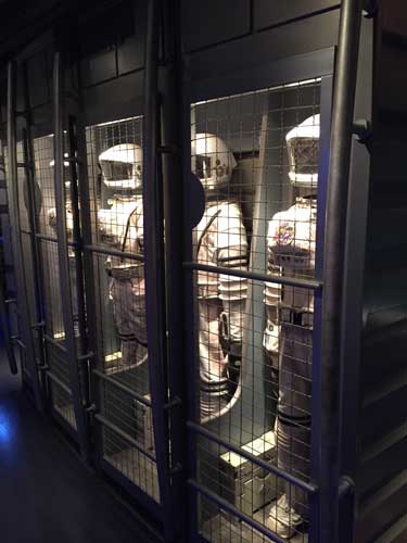
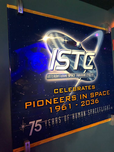
When approaching Mission: Space, the striking exterior promises a cool experience and contrasts sharply with structures from the original EPCOT Center. The pre-show area includes several nods to Horizons and props from the Mission to Mars film. It is well-done and sets the mood, but it also feels like a theme-park queue. Disney should refresh this area both for comfort and to sell the excitement.
The most distinctive feature of the pre-show is the frequent warnings about claustrophobia or motion sickness. Given this attraction’s rough history, I understand this caution. Instead of feeling thrilled about the wonders of spaceflight, however, we are nervous about puking. The Green version allows guests to experience Mission: Space without spinning and float around the Earth. Even so, I’d love to see a more inventive way to present the warnings. This relates to the tonal updates in idea #4.
2. Lose the Simulation
The premise of the Orange version is flight training for the first mission to Mars. Gina Torres (Zoe from Firefly) has taken over the role as the leader from Gary Sinise. The choice to make the story a simulation is odd because it eliminates the danger when all hell breaks loose. It does connect more closely to the constant testing experienced by real astronauts, but it also limits the stakes.
I’d rather see this attraction lean into the idea that we’re venturing into space. This would make it exciting for younger guests that might believe in the concept. It also would change the tone into more than just a serious exercise. Optimism about the future of space travel would help to build a sense of adventure.
3. Give the Guests More Control
Despite a believable setting and straightforward tone, the attraction’s resolution is strange. Why are all four passengers using a joystick? Who is flying the ship? The duration is only about five minutes, and it flies by quickly. The downside is that there’s little time to enjoy the journey before the climax at Mars. The brief time for hyper sleep is the exception and provides a relaxing break following the intense launch.
The technology for interactive experiences has improved dramatically since 2003. I don’t expect it to match Smugglers Run, but there should be consequences for our actions. The ride should change based on multiple steps for each role. Increasing our involvement would lead to multiple rides to enjoy it all. It’s fun to press a button and have something happen; we need more actions that matter!

4. Lighten the Tone
Without starting over, Disney could also adjust the atmosphere; no one is having any fun! I’m not asking them to dumb down the story. The pre-show needs more clever touches. Just look at how much Soarin’ gains through Patrick Warburton’s tongue-in-cheek spiel. Torres and the other hosts are playing it all so straight! I appreciate intelligence in my EPCOT attractions, but it shouldn’t be at the expense of fun.
A good model is the work of Bill (John Michael Higgins) and Sherry on the original Test Track. They still conveyed the important details but had fun. It would take some capital investment to create new video and audio, but it wouldn’t be that high. I’m the target audience for this attraction, but it feels too flat. I love Torres, and she isn’t as stiff as Sinise, but it’s still too serious!
5. Customize the Destinations
Lightening the tone would help, but the most important fix is within the ride. Screen-based attractions benefit tremendously from variations. When you consider the possibilities of space travel, one scenario is too simple. The success of Star Tours — The Adventure Continues shows what is possible with simulators. Why not set up Mission: Space in the same way? This type of variety would revitalize the pavilion.
Admittedly, it would take significant investments for Disney to re-program the attraction and create new videos. However, the benefits for drawing crowds and alleviating lines at nearby rides like Test Track would be worth the money. Disney could maintain the Orange and Green variations and build multiple options for each side. The launch is the show stopper, and the rest of the ride could vary. A smart move would be splitting the ride into three sections; Disney could then mix and match the different versions randomly like they do with Star Tours.
6. Create an Inspiring Post-Show Experience
When I think about ways to improve EPCOT without spending millions, updating the post-show area seems like a great idea. The Advanced Training Lab includes some fun games to occupy our time, but most guests just blow past them. This space could tie directly to the attraction experience. You could learn more about what happened on the ride and how well you performed under pressure.
This area could also include an exhibit on recent news about the space program. The success of the Dragon spacecraft’s trip to the International Space Station is a perfect example. This wouldn’t be a dull history lesson either. Disney could work directly with SpaceX to present both recent and future advances. These changes would also connect to the EPCOT message of discovery and optimism about what’s on the way.

A Permanent Fixture
I’d just like to see Disney work to improve an attraction with so much potential. However, I don’t see them making huge changes to Mission: Space anytime soon. That’s why I’m not writing about my hopes for a new attraction. EPCOT has other spaces that deserve that treatment first, particularly the Imagination pavilion. The positive aspect of my ideas is that they wouldn’t take five years.
My final point is about of IP at EPCOT. Finding ways to connect the attractions to the brand will continue, especially under Chapek. Mission: Space could be a shining exception. Why not create something universal that connects to future space exploration? There is so much potential even from small changes. With the right upgrades, Mission: Space could be a true E-ticket attraction. Let’s make it happen.
What do you think about Mission: Space and my ideas for upgrading it? What would you change?
Related Articles – Mission: Space
Ranking the Attractions at EPCOT in Walt Disney World
Listen to The Tomorrow Society Podcast, Episode 111: Improving EPCOT (Part 2)
Destination Moon: The Apollo 11 Mission Exhibition
This post contains affiliate links. Making any purchase through those links supports this site. See full disclosure.


Leave a Reply