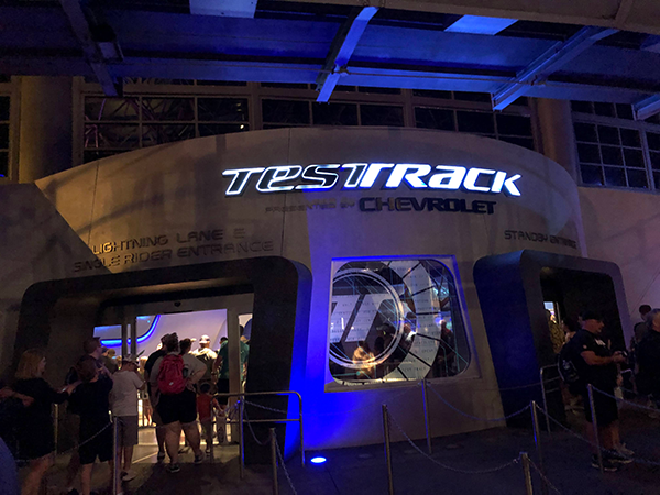
Now that Test Track 2.0 has officially closed on June 17, it’s time for a way-too-early tribute article! I recognize that we are going to see a new version of Test Track that probably will retain many elements we love about this EPCOT headliner. I doubt the high-speed ending will feel that different in the update. But that’s future speculation! I’m living in the present right now, or at least a few weeks ago.
I’ll say up front that I loved World of Motion when I was younger; it had everything you could ask for in an EPCOT Center attraction. There was off-beat narration from Gary Owens, a cool opening with a perfect view of Spaceship Earth, funny gags and a gazillion animatronics, multiple speed rooms (!!!), and a stunning futuristic city. I understand that replacing it was sponsor-driven and part of a push for more thrills at Walt Disney World. Two things can be possible at the same time; I miss World of Motion, but I also really enjoy Test Track.
Opening in March 1999, the original Test Track represented groundbreaking technology but often broke down near the start. Once it got rolling, it quickly became one of the resort’s most popular attractions. Spurred by deft comic timing from John Michael Higgins, the ride never felt serious. Yes, we learned some things about how a GM test facility works, but it didn’t seem too dry. It helped to have multiple high-speed moments, especially at the end. Guests weren’t crying out for an update, but this version closed for a redo on April 15, 2012. Let the era of interactivity begin!
The Dawn of MagicBands
I’ve spoken to several Imagineers recently about Test Track 2.0, and they reminded me that it was the first attraction designed for the MagicBand technology. This fancy new device (for 2012) allowed you to design a car and take it with you in the ride and beyond. It’s a fun idea that mostly worked despite a few glitches here and there. Before smart phones became so prominent, the chance for guests to personalize their experience was at the core of this update.
Growing up in the ‘80s and ‘90s, I loved anything that felt interactive. At our local science museum, even just pressing a button and making a light appear was amazing! It’s a different world today obviously, and rapidly changing technology created big challenges at Test Track 2.0. How could the designers create a format that wouldn’t seem dated in a few years? For the most part, I believe they made the right choices to keep it timeless.
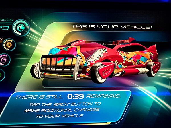
I mentioned my history because I’ve observed the same excitement from my kids when they design a car at Test Track. It’s easy for jaded adults to forget how fun it is just to create something of your own anywhere, much less at a Disney park. They always loved the pre-show experience, including my most recent trip with my 11-year-old. Instead of watching a video we’ve all seen a million times, this pre-show gets us involved in designing a ridiculous car. And it’s fun every time!
Futuristic Vibes
Disney focuses a lot on storytelling in theme park attractions, and some of that chatter doesn’t resonate much with me. I’ve always been more of a vibes guy. Honestly, I usually don’t care that much about plot with my favorite theme park attractions. Do I understand what happens to the doomed guests on the Twilight Zone Tower of Terror? Heck no! In Test Track 2.0, we venture onto the Sim Track and experience what I think is a computer simulation of various rode conditions. But it doesn’t really matter that much to me, and that’s okay.
What I love about the updated pavilion is the switch to a cooler, futuristic atmosphere. I understand if you miss the humor from the original, but I’d argue the vibes are much better. A big reason is the wonderful score from Paul Leonard-Morgan (Dredd, Limitless). If you’re curious to learn more, I had a great chat with him about the Test Track score on Episode 45 in 2018. Paul’s music builds the tone from the moment you approach the building and continues throughout the attraction.
Beyond the music, I really like the look of the queue as you stroll down the narrow corridors. The prior version was loud and metallic to convey the look of a working GM facility. While it felt more realistic, I wouldn’t call it a pleasant experience. The environment in Test Track 2.0 matches the best parts of EPCOT’s Future World aesthetic. It conveys both calming vibes and optimism for a better tomorrow. I’ll admit the cramped halls can be a little tight when the line is moving slowly, but it works well at night when the crowds have lessened.
Designing the Sim Car
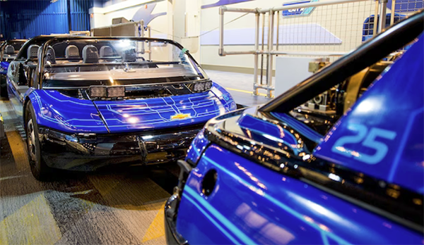
The big change for Test Track 2.0 was the pre-show, which now involved designing your own “Sim Car”. You step into a room filled with basically touch-screen computer stations with a futuristic aesthetic. My kids have always loved this part of the experience, and I never get to design the car. You’re able to choose all the characteristics of the car and make it look ridiculous with a peculiar shape and lots of color and flair. It’s also more engaging than watching the same video each time.
I should be fair and note that our designed cars didn’t always appear like they should within the ride experience. I like the idea of using the four attributes of Capability, Efficiency, Responsiveness, and Power to assess our designs. They also correspond to the tests we experience on the ride. It’s an easy way to reveal how our decisions with our ridiculous designs impact the success of the car.
It’s also fun to compare our results to other passengers’ designs (when it works correctly). This adds a layer of competition that helps guests become more involved in the attraction. I like any change that makes each ride feel different even if it’s just a score on a screen. That addition ensured that we had a tiny degree of control over a small part of the attraction each time.
A Revamped Ride Experience
The track remains the same for this second version of Test Track, but a lot has changed around us. We’re now connecting to OnStar, which I didn’t realize was a subsidiary of GM until I researched this article. I feel like this service isn’t as prominent to the public today, but I also haven’t owned a GM car. The initial ascent is no longer a test, so we’re on our way to our first big Capability test. It’s basically the spot where we tested our regular and anti-lock brakes in the original.
I like the animated screens here, which create a futuristic vibe especially in the second time we accelerate. However, it doesn’t pack the same punch for me as it did previously. The original Test Track building felt more open here, so it seemed like you were completely out of control. Having the screens around you actually creates a frame that makes the track easier to follow
Next up is the Efficiency test, which feels like a step back from the prior version. I liked the look of the empty office as you experienced hot and cold weather conditions. It also included John Michael Higgins’ classic line on if they remembered to turn off the robots. This area felt more lived-in here and believable in 1999. The “hyper spectrum imaging” is a fun effect, but this area halts the momentum. It’s just not as memorable this time despite following the same path.
Power and Speed
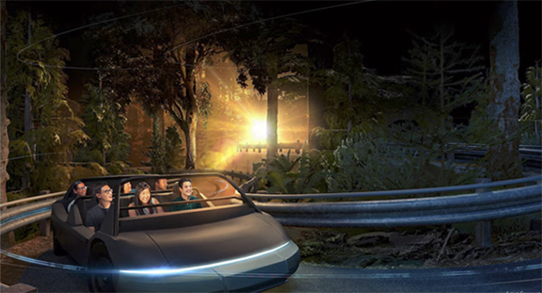
The first two tests were really just the appetizer, and our pace kicks up from here. This portion feels pretty similar to the original version, but with updated music and effects. Next up is the Responsiveness test, which speeds up our vehicle as we go around tight turns in a simulated environment. I suspect there will be more physical sets here in Version 3.0. It’s a quick sequence that culminates with us nearly colliding with the same 18-wheeler as usual (with new effects).
I love how Test Track gradually increases the thrills to prep us for the high-speed ending. We’ve now reached the Power test, originally the barrier test to scare first-time riders. The excitement of the launch outside gets me every time. We keep getting faster with each successive banked turn before ultimately hitting 64.9 miles per hour at our fastest point. This finale hasn’t really changed much in Version 2.0. Why mess with such a cool and thrilling moment?
A More Complete Experience
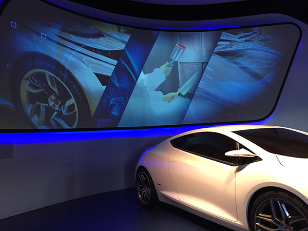
While it can’t match World of Motion’s TransCenter, the post-show area has been upgraded for this version. The big reason is the MagicBand, which allows you to bring your design to various activities. You can even make a cheesy commercial using your car! I did that for the first time with my daughter on our trip this year, and it provided some good laughs. The fun games extend the life of our designs to more than just the ride experience.
While it feels simple by today’s standards, the interactivity within Test Track 2.0 represented a new step for Disney in 2012. Being able to store your design through your MagicBand expanded what was possible in this pavilion. The post-show exhibits were showing their age 12 years later, but they still created a foundation for more advanced possibilities from Disney with the technology.
What’s Next for Test Track?
Test Track 2.0 ultimately closed on June 17, 2024 for a big change that will likely take a year (if not more). It’s unclear exactly what the Imagineers will update for the third iteration. Disney has talked about paying tribute to World of Motion, and that’s always good to hear. I’m keeping my expectations low on that front, however. I suspect we’ll see new physical sets, a possible appearance of “It’s Fun to Be Free”, and a more whimsical vibe.
What’s unclear is whether designing a car will still be part of the new version. I know that a lot of guests still enjoy this part of the experience, so it will be interesting to see what happens with that part of the pre-show. Regardless, I’m optimistic that Test Track 3.0 will continue to thrill guests at EPCOT well into the future. Bye now!
Listen to my interviews with Paul Leonard-Morgan and Trevor Bryant about Test Track 2.0 on the Tomorrow Society Podcast.
Related Tribute Articles: Test Track 2.0
Back Over the Falls: A Tribute to Maelstrom
You Make the World Go Round: A Tribute to Universe of Energy


Leave a Reply